Build an iOS App from Scratch with SwiftUI
Background
On Valentine’s day 2021 I put together a small static website, Infinite Love, to hold a handful of pictures. Because it is static, adding a new photo means editing the source and redeploying, not something you want to do from your phone. So I set out to wrap it in an iOS app with a proper “new post” button.
I had done plenty of web development, but this was my first time writing anything for iOS. What follows is the walkthrough I wish I’d had: taking an empty Xcode project all the way to an app running on a real iPhone.
By the end we’ll have an app with three tabs (a scrollable Story feed that loads photos from the web, a New button in the middle of the tab bar, and a Settings screen) that adapts to light and dark mode out of the box. The road map:
- Set up the Xcode project
- Give the app a face: app icon and launch screen
- Build the navigation with a custom tab bar
- Render the photo feed from a data model
- Get it onto your iPhone
Note: this tutorial is based on macOS 12.4, Xcode 13.4.1, and iOS 15.5, so some details may differ on newer versions.
Set up Environment in XCode
- Open Xcode and either click “Create a new Xcode project” in Xcode’s startup window, or choose File > New > Project.
- In the template selector, select iOS as the platform, select the App template and then click Next.
- Enter the product name, select “SwiftUI” for the interface and “Swift” for the language, and click Next. Choose a location to save the project on your Mac.
For more information, please refer to the official documentation.
User Interface Design with SwiftUI
App Icon and Launch Screen
App Icon
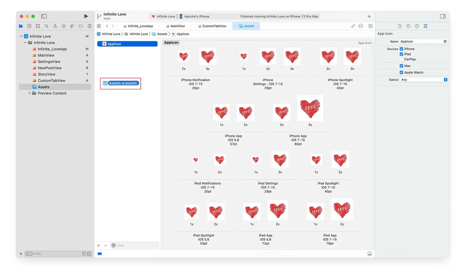
Create the app icon at App Icon Generator and download the archive file containing different sizes of icons.
Open Assets in the left sidebar in the Xcode project and drag Assets.xcassets into the project. They will be automatically assigned.
Launch Screen
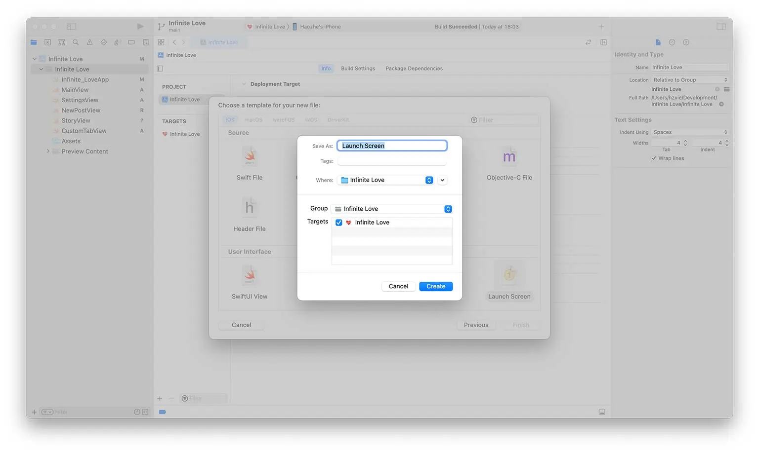
To create the launch screen, add a new file to the project with Launch Screen as its template.
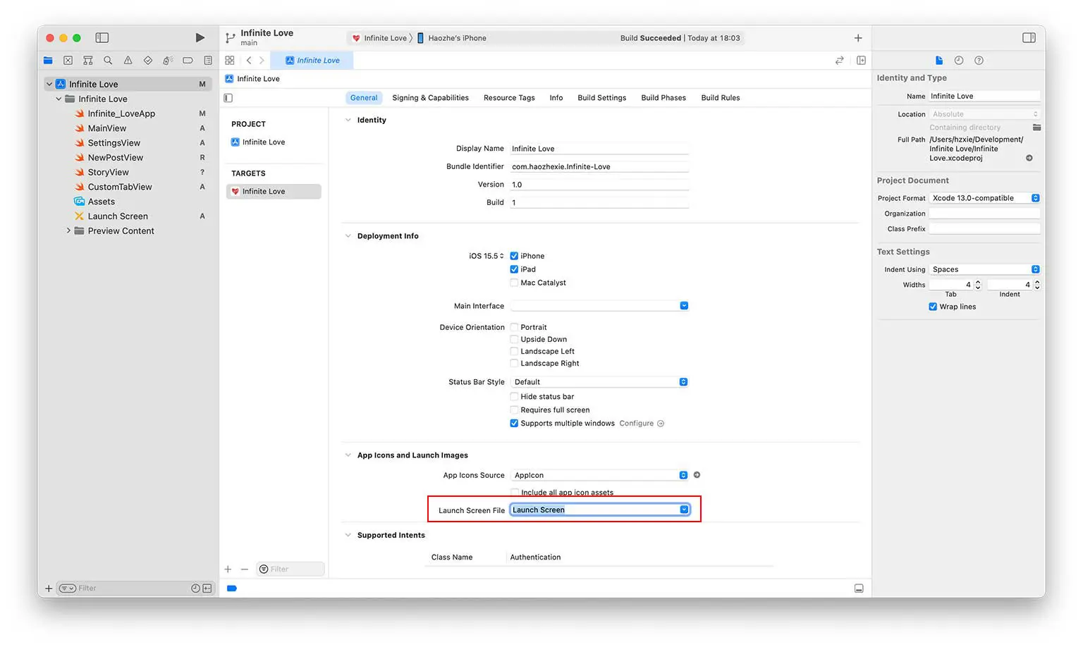
Associate the launch screen file to the created launch screen in the project’s general settings.
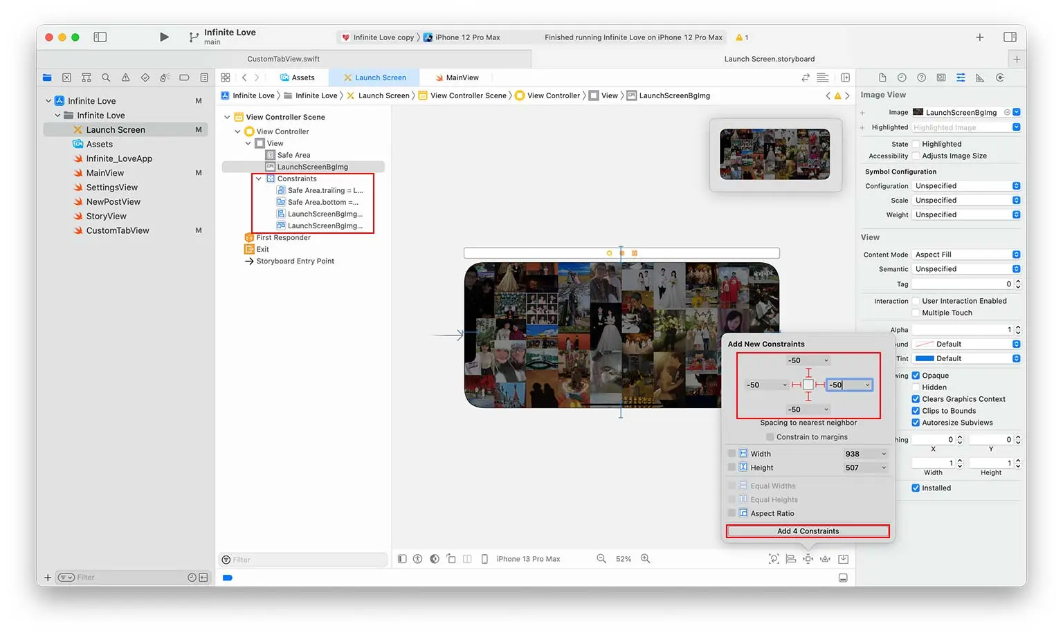
By default, the launch screen contains a Label control with the app name on it. To display an image on the launch screen, we need to add an ImageView control (Press ⌘+⇧+L and drag ImageView to the launch screen view).
The image path can be set in the right sidebar. To make it fill every screen size, pin the control to the four edges with the “Add 4 Constraints” button; the constraints then appear in the left sidebar.
For more information, please refer to the video.
Views and Tab Bars (Bottom Navigation)
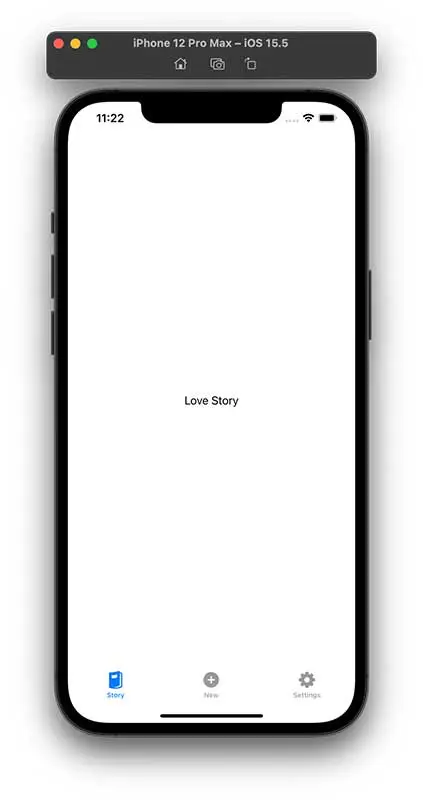
In the iOS app, we create three views, named “StoryView”, “NewPostView”, and “SettingsView”. The implementation is shown below.
struct StoryView: View {
    var body: some View {
        Text("Love Story")
    }
}

struct NewPostView: View {
    var body: some View {
        Text("New Post")
    }
}

struct SettingsView: View {
    var body: some View {
        Text("Settings")
    }
}
To switch between views, we need to create a tab bar at the screen’s bottom. There are two ways to create a tab bar. The one is to use the default one provided by Swift UI, and the other is to create a custom one.
Default Tab Bar
struct MainView: View {
var body: some View {
    TabView {
        StoryView()
            .tabItem {
                Image(systemName: "magazine.fill")
                Text("Story")
            }
        NewPostView()
            .tabItem {
                Image(systemName: "plus.circle.fill")
                Text("New")
            }
        SettingsView()
            .tabItem {
                Image(systemName: "gearshape.fill")
                Text("Settings")
            }
    }
}
}
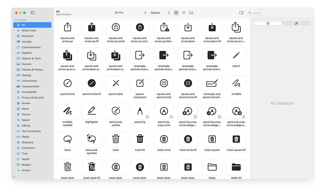
The icon name in the button navigation can be found in the SF Symbols application.
Custom Tab Bar
If we want to add a button in the center of the tab bar, we need to implement a custom tab bar. More explanation can be found in this video.
enum ViewName {
    case Story
    case Settings
    case NewPost
}

struct MainView: View {
    @State private var currentView: ViewName = .Story
    var body: some View {
        VStack {
            switch currentView {
            case .Story:
                NavigationView {
                    StoryView()
                }

            case .NewPost:
                NavigationView {
                    NewPostView()
                }

            case .Settings:
                NavigationView {
                    SettingsView()
                }
            }
            CustomTabView(currentView: $currentView)
        }
    }
}
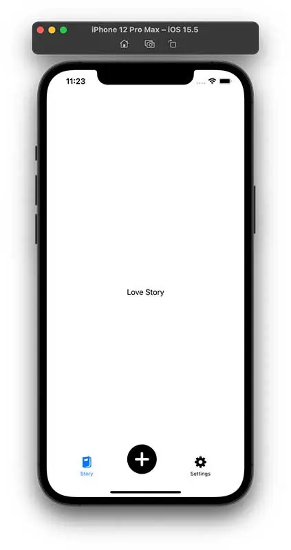
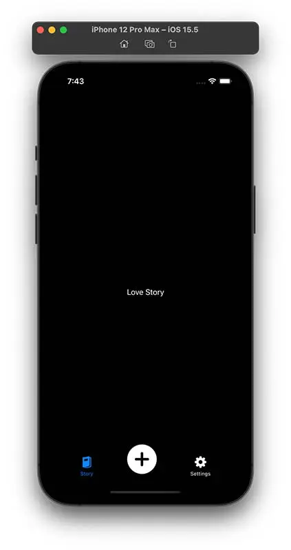
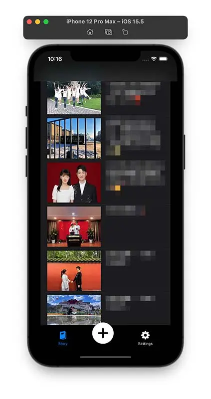
The CustomTabView takes a parameter that indicates the name of the current view. Since the release of iOS 13, Apple allows users to choose between light and dark system-wide appearance. @Environment(\.colorScheme) var colorScheme detects which mode is enabled in iOS. As shown in the figure on the right, the app UI already looks great in dark mode even without any modification. The full implementation is shown below.
struct CustomTabView: View {
    @Environment(\.colorScheme) var colorScheme
    @Binding var currentView: ViewName
    var body: some View {
        HStack {
            Spacer()

            Button {
                currentView = .Story
            } label: {
                VStack {
                    Image(systemName: "magazine.fill")
                        .resizable()
                        .scaledToFit()
                        .frame(width: 25, height: 25)
                    Text("Story")
                        .font(.caption2)
                }
                .foregroundColor(currentView == .Story ? .blue : .primary)
            }

            Spacer()

            Button {
                currentView = .NewPost
            } label: {
                ZStack {
                    Circle()
                        .foregroundColor(colorScheme == .light ? .white : .black)
                        .frame(width: 25, height: 25)
                        .shadow(radius: 2)
                    Image(systemName: "plus.circle.fill")
                        .resizable()
                        .frame(width: 64, height: 64)
                }
                .foregroundColor(currentView == .NewPost ? .blue : .primary)
                .offset(y: -16)
            }

            Spacer()

            Button {
                currentView = .Settings
            } label: {
                VStack {
                    Image(systemName: "gearshape.fill")
                        .resizable()
                        .scaledToFit()
                        .frame(width: 25, height: 25)
                    Text("Settings")
                        .font(.caption2)
                }
                .foregroundColor(currentView == .Settings ? .blue : .primary)
            }

            Spacer()
        }
    }
}
Custom Image List
To display the image list in StoryView, we define a new class, named Post.
import Combine

class Post: ObservableObject {
    @Published var image: String
    @Published var text: String

    init(image: String, text: String) {
        self.image = image
        self.text = text
    }
}
An ObservableObject notifies its subscribers whenever one of its @Published properties changes, so any view observing a Post re-renders automatically when the post’s image or text is updated.
With the defined Post class, the content in StoryView can be generated by passing an array of Post. Here, we also adopt HStack to arrange the image and text horizontally. Note that AsyncImage introduced in iOS 15 allows the app to load images directly from the Internet. The full implementation is shown below.
struct StoryView: View {
    var posts = [
        Post(image: "https://love.haozhexie.com/img0.webp", text: "Text 1"),
        Post(image: "https://love.haozhexie.com/img1.webp", text: "Text 2"),
    ]

    var body: some View {
        List {
            ForEach(posts.indices, id: \.self) { idx in
                HStack(alignment: .top, spacing: 20) {
                    AsyncImage(url: URL(string: posts[idx].image)) { image in
                        image.resizable()
                    } placeholder: {
                        ProgressView()
                    }
                    .frame(width: 160, height: 120)

                    Text(posts[idx].text)
                        .font(.system(.body, design: .rounded))
                }
            }
        }
    }
}
Deploy the App on Your iPhone
There are several ways to deploy the app on an iPhone, depending on who you want to reach and whether you have a paid Apple Developer subscription.
- App Store Distribution. The standard way to ship to the public. You upload the build to App Store Connect, submit it for App Review, and once approved anyone can install it from the App Store. This requires a paid Apple Developer Program membership ($99/year).
- Ad-Hoc Deployment. Distribute the app to a limited set of devices without going through the App Store, which is handy for beta testing. You have to register each device’s UDID in your developer account (up to 100 devices per device type per year), and it also requires the paid membership.
- Enterprise Deployment. Intended for organizations that distribute in-house apps to their own employees, bypassing the App Store entirely. It relies on the separate Apple Developer Enterprise Program ($299/year) and is not meant for public distribution.
- Non-market App Distribution (without Apple Developer Subscription). Free, and the simplest option for installing the app on your own device.
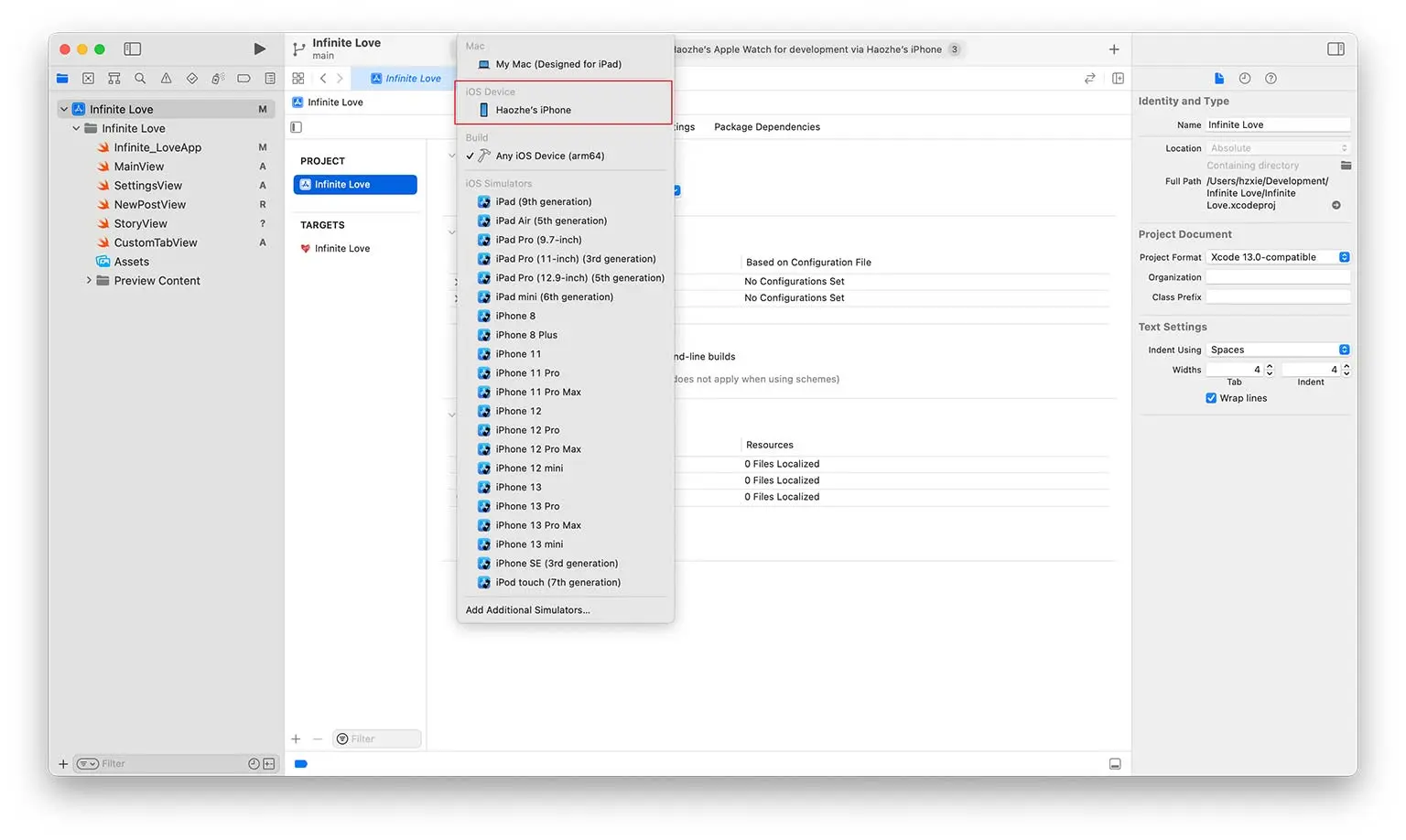
For non-market app distribution, you can simply connect your iPhone to your Mac with cables, and trust the developer certificate on your iPhone. Then select the target device to your iPhone (as the image shown below). Note that with a free account the app signature expires after 7 days, after which you need to rebuild and re-install it from Xcode.
Closing Thoughts
That’s the whole arc, from an empty Xcode project to an app running on a real iPhone. Coming from web development, SwiftUI felt surprisingly familiar: declaring a view as a function of its state isn’t far from how component-based front-end frameworks work, and niceties like automatic dark-mode support meant a lot of polish came for free.
I’ll be honest, this one never grew past a personal experiment and didn’t make it to the App Store. But as a first contact with iOS it was well worth it: a low-stakes way to see how the pieces (views, navigation, data models, and code signing) fit together. If you’ve only ever built for the web, an afternoon project like this is a good way to get a feel for the platform.
References
- https://www.appcoda.com/learnswift/
- https://developer.apple.com/tutorials/swiftui/interfacing-with-uikit
- https://developer.apple.com/documentation/xcode/specifying-your-apps-launch-screen
- https://iosapptemplates.com/blog/swiftui/tabview-swiftui
- https://www.youtube.com/watch?v=Ey0_kbAeWKg
- https://www.youtube.com/watch?v=v19fln0e_qQ
The Disqus comment system is loading ...
If the message does not appear, please check your Disqus configuration.